Sofiya Pikusheva

Velour Dark Typeface

Description

Year – 2025

Typeface Development

Velour Dark is a display typeface that mixes sharp edges with soft curves to create a feeling of mystery and elegance. It was inspired by witchy themes and Tim Burton’s style, aiming to feel magical but still clean and readable. Velour Dark works best for titles, covers, packaging, and projects that need a bold but stylish look. The letters were carefully designed to avoid feeling too harsh or too simple, making the font flexible for different types of creative work.

First Sketches

The first sketches for Velour Dark explored style, contrast, and edge sharpness while blending two font inspirations. This stage defined its refined yet natural look before the full typeface was built.

Further Development

After finalizing the main style, the focus shifted to refining shapes, contrast, and spacing for consistency. Small adjustments to curves and details helped balance the letters while preserving the original character of the design.
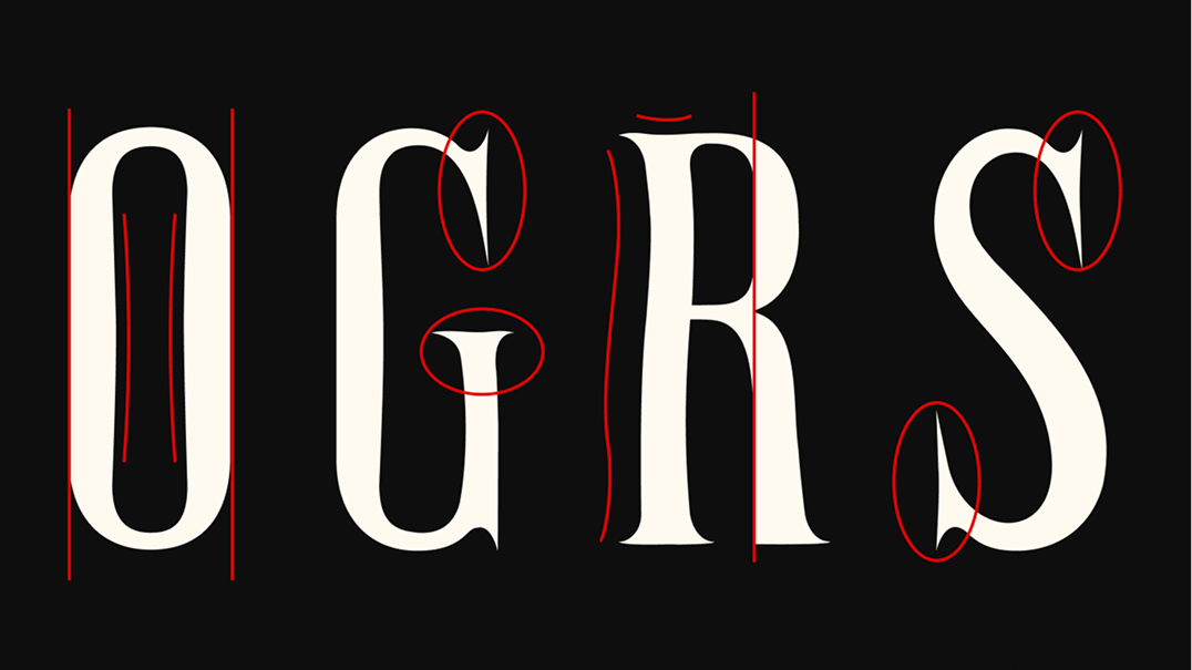
Unique Features

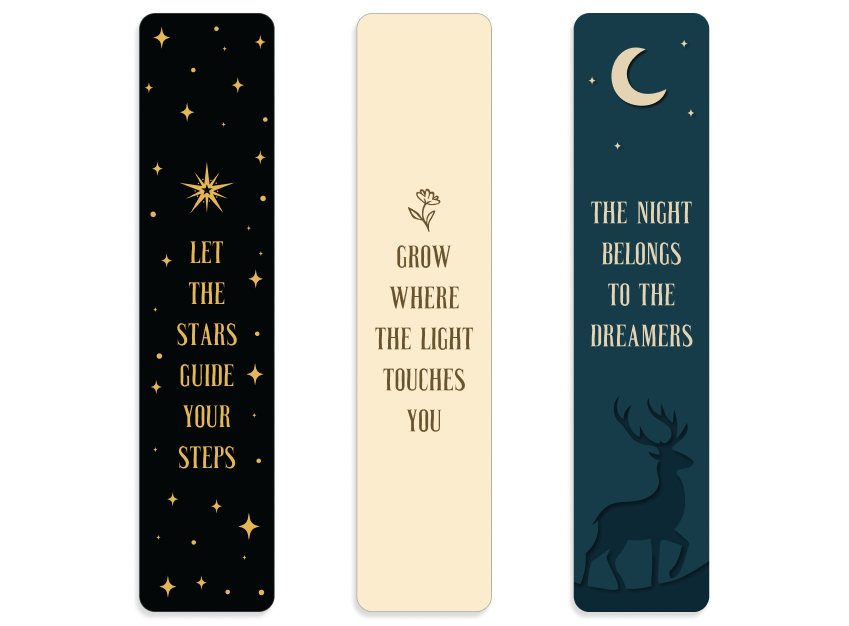
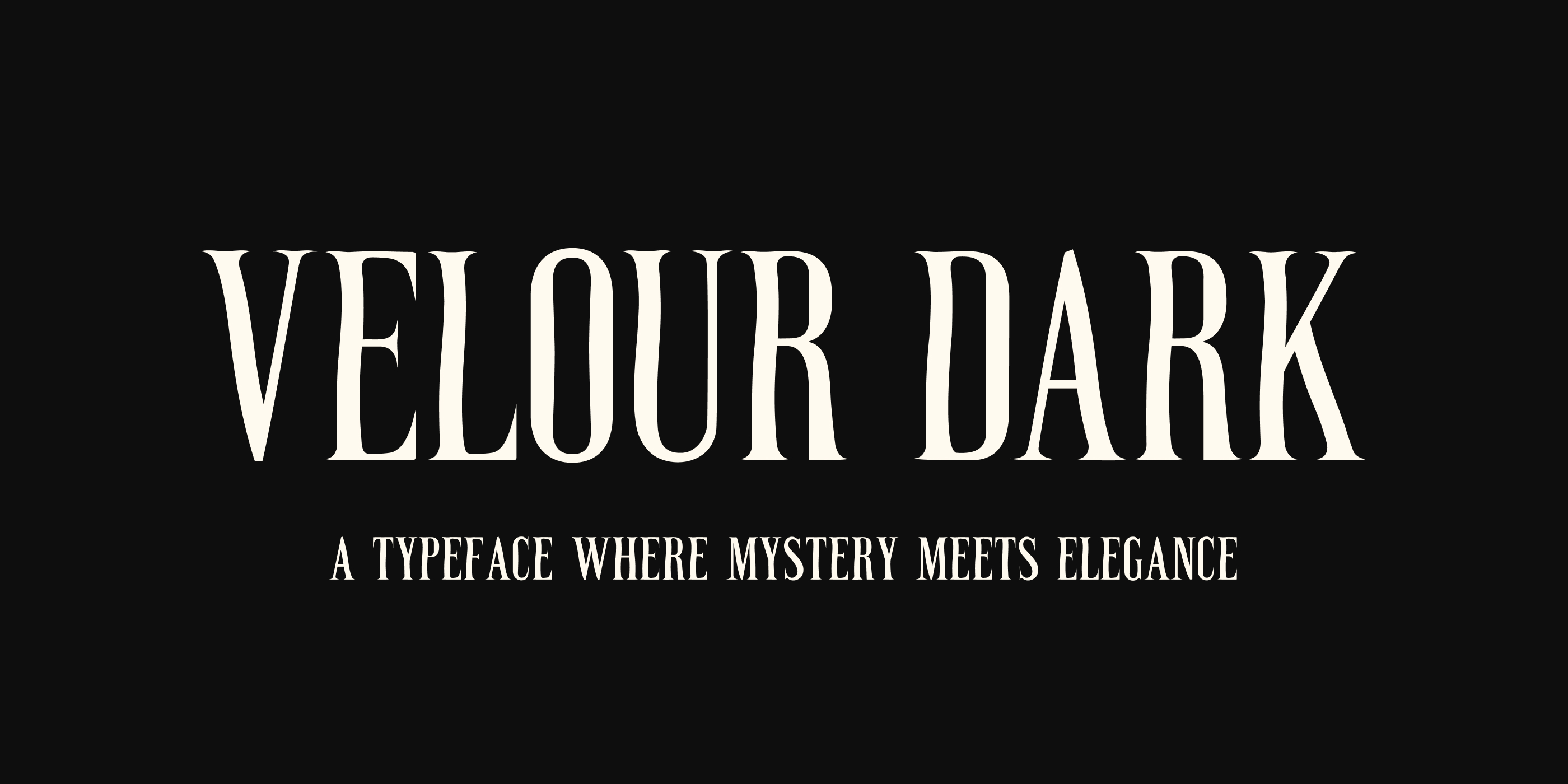
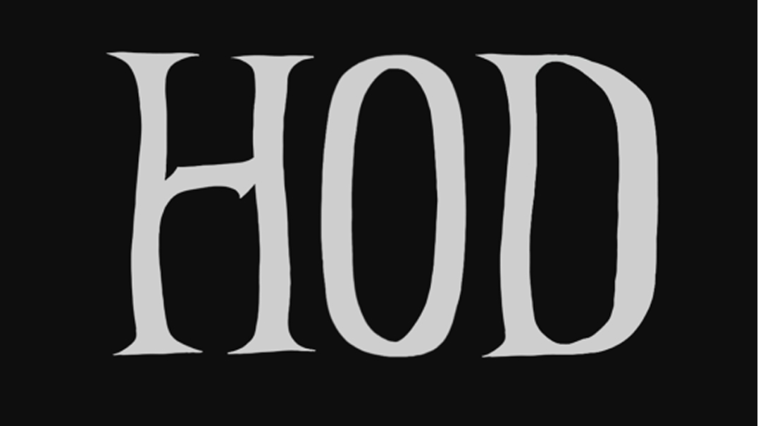
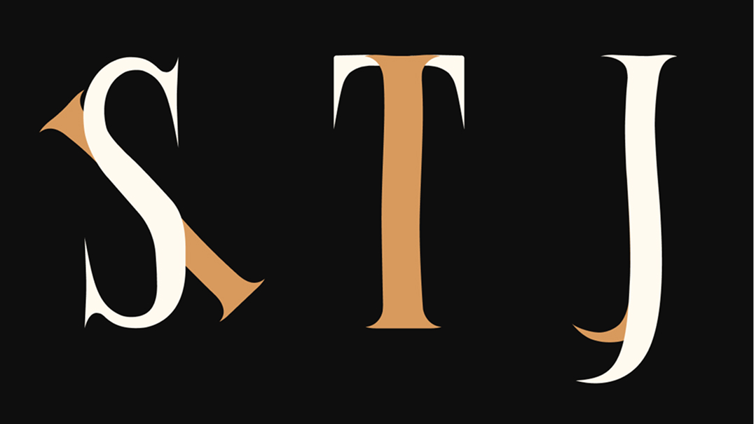
Velour Dark features sharp serifs, smooth inward curves, and strong verticals that give it a bold yet balanced look. Consistent details keep the typeface cohesive and ideal for display use.

Using Velour Dark

Tarot Card Set & Box

Velour Dark was used for the Mystic Reverie Tarot to bring out the deck’s mysterious and elegant feeling. The sharp serifs, narrow curves, and bold shapes match the themes of magic, fate, and storytelling found in tarot. The font adds structure to the designs while keeping a soft, slightly eerie mood. Its strong presence helps organize the deck visually without taking away from the illustrations or symbols.

Book Cover

Velour Dark was used for The Enchanted Forest book cover to create a calm yet mysterious atmosphere. The sharp serif details and narrow curves of the font add a sense of structure without making the design feel heavy. The typeface supports the layered paper-cut style illustration by providing strong but smooth letterforms that match the natural flow of the artwork. Its bold shapes ensure the title remains readable while fitting the quiet, magical mood of the scene.

Poster

Velour Dark was used for the Grow Where the Light Touches You poster to highlight the message with clear and structured lettering. The typeface supports the soft, natural theme without feeling heavy or out of place. This piece also shows a contrast to the previous darker applications, proving that Velour Dark can work in both light and dark settings while keeping a consistent style.

Bookmarks

This set of bookmarks was created to showcase how Velour Dark can adapt to different themes and atmospheres. Each design highlights a unique style — mystical, natural, and dreamy — allowing the font’s consistent structure to tie them together visually. Seeing the three bookmarks side by side emphasizes the font’s ability to stay recognizable across a range of design directions.